Work.
The contexts change. The job doesn’t: understand the workflow, give everyone one shared picture and design something people can build.
Three recent enterprise projects, followed by two earlier pieces of work. Scroll or use the project index to jump between them.
Projects
Jump to a project:
WORK / ABSA CIB
Absa Corporate and Investment Banking
From Word, Excel and email to one coherent product system.
Large corporate credit applications were assembled across Word, Excel and email, then recaptured into CAP, the mandated credit platform that did not match how analysts actually worked.
The problem was not just one bad screen. It was the whole chain: fragmented ownership, duplicated work, long forms, disconnected outputs and decisions scattered across meetings and inboxes.
Role: Lead Product Designer
Setting: Enterprise credit
What I changed: Discovery, a shared decision system and buildable product patterns
Result: Sponsor-approved patterns moved into build and testing.
WORK / ABSA CIB
Discovery
Make the invisible work visible.
I interviewed analysts, credit sanctioners and stakeholders, walked the process end to end and transposed the scattered evidence into a shared picture of how the work actually happened.
The research showed where CAP, Word, Excel, email, facility schedules and final PDFs had drifted apart.

WORK / ABSA CIB
A shared way of working
A fresh approach, not another forgotten repository.
Before this, the project had no shared record of past decisions and agreed priorities. Evidence and actions lived across meetings, Teams threads, inboxes, documents and people’s heads.
I used distributed Loop components, annotated Figma files and a shared backlog to connect the work without imposing another Byzantine repository. Business, design and technology could trace a decision from discovery through design and into build.

WORK / ABSA CIB
A practical product system
Code, design and output as one system.
We could have designed an idealised replacement in Figma. Instead, I chose to work from CAP’s existing code and components, because the new experience still had to survive the realities of the product underneath it.
The Figma library mapped CAP’s existing Bootstrap components and CSS, then aligned them with Absa’s design system and branding.
Reusable components connected the interface, system emails and facility schedules. Developers could build from real constraints rather than a separate design fiction.
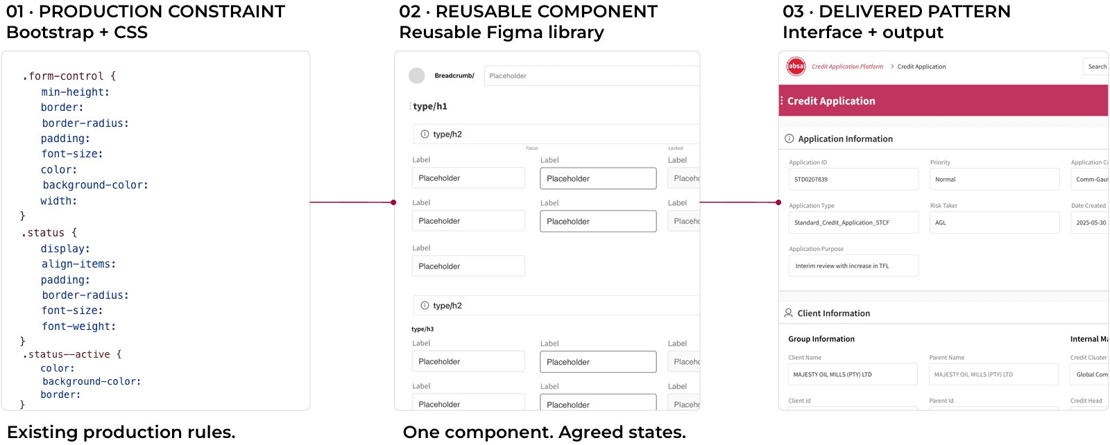
A clean-sheet redesign would have looked cleaner in Figma and been much harder to ship.
WORK / ABSA CIB
Results
Design to survive delivery and beyond.
Sponsor-approved layouts moved into build and testing, including sticky navigation and autosave for long applications.
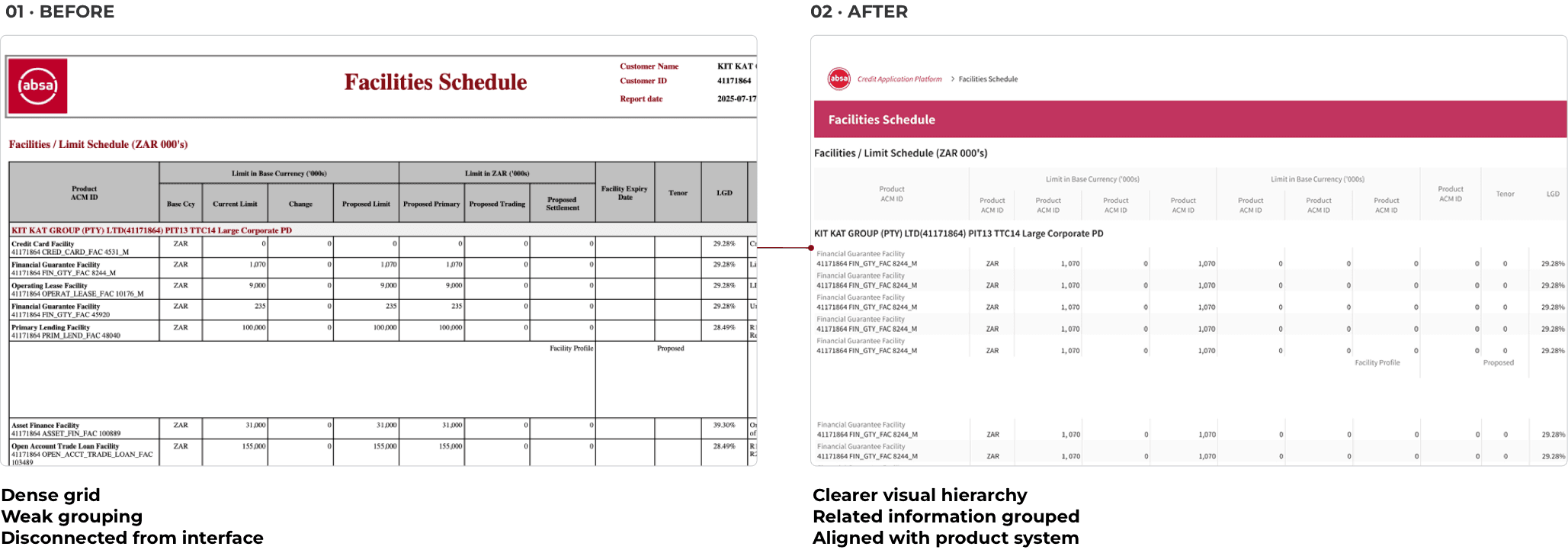
The shared backlog gave the team an agreed route for future releases, and the same product system extended into clearer facility schedules, report layouts, and emailed workflow updates.
Product owners, project managers and analysts adopted and adapted these reusable protocols to connect evidence, decisions, design and delivery across business and technology.

“The interface is much easier to work with, makes more sense, and far better for long sections. The scrolling makes the application easier to follow, and the layout flows naturally. Financial spreads are easier to work with too, including moving line items up and down.”
– Kerusha, Senior Analyst, Absa CIB
“Tim surfaced key blind spots, created artefacts the team can reuse and influenced key decisions through the quality of his communication.”
– Celestine “Zie” Ngulube, Head of Design, Absa CIB
work / MTN

MTN
One shared picture for teams split across countries, tools and priorities.
MTN’s buying journey had become long and difficult to coordinate across teams in South Africa, Dubai and India. Buying a phone felt more like applying for a mortgage than buying yourself a treat.
Rather than pass separate UX deliverables between teams, we mapped the entire buying journey in one screen-by-screen visual specification: part journey map, part prototype, part meeting agenda and part single source of truth.
Role: Senior Product Designer
Setting: Telecoms
What I changed: Shared specification, alignment and delivery
Results: Sales funnel drop-off fell from 78% to 52%.
WORK / MTN
One place to disagree
The meeting, prototype and handover were the same thing.
We could have produced separate journey maps, wireframes and handover documents. Instead, I kept the journey and its decisions together in one working model, so teams could resolve disagreements before they became expensive production problems.


Business, product, design and development could annotate the same journey, see its dependencies and agree what would be built across releases.
Each point in the journey held the screen, business notes, development detail, API calls and known fallouts. We could discuss a step alongside its evidence and dependencies, rather than reconstructing the context in another meeting.
The visual specification became the product conversation made visible. Instead of reconstructing the journey through an incremental slog of requirements, use cases and workshops, teams could work through it together and make decisions asynchronously or in the room.

Years later, the shared whiteboard was still evolving as the team’s preferred view of the work.
“Wherever I am, no matter who I’m talking to, the visual spec is the first thing I pull up.”
– Bryton, Product Owner
WORK / MTN
Results
A signed-off redesign in weeks.
Earlier attempts had taken months; the shared visual specification gave the teams one place to resolve the journey and reach sign-off.
A 27-screen journey became an 18-click flow.
The redesigned journey reduced a 27-screen slog to an 18-click shortcut from “I want that” to “you’ve got it”.
work / Plaster House

The Plaster House
A clearer story, a simpler way to help, and room to grow.
The Plaster House – now Kafika House – was a donor-funded rehabilitation home in Tanzania. It needed a website that explained its work, showed where the money went and made it easy for people to help.
Role: UX/UI Designer
Setting: Children's hospital charity
What I changed: Storytelling, transparency, donations
Result: Donations increased fourfold.
WORK / PLASTER HOUSE
A clearer reason to give
Three clicks to donate, with a clear view of where the money went.

A three-click donation path removed unnecessary friction.

Dense, text-heavy pages became plain visual explanations of where donations went, improving transparency across the website, social posts and annual reports.
WORK / PLASTER HOUSE
Remote, before it was routine
A client in Tanzania and Australia, design in California, development in Tennessee, and UX from South Africa.
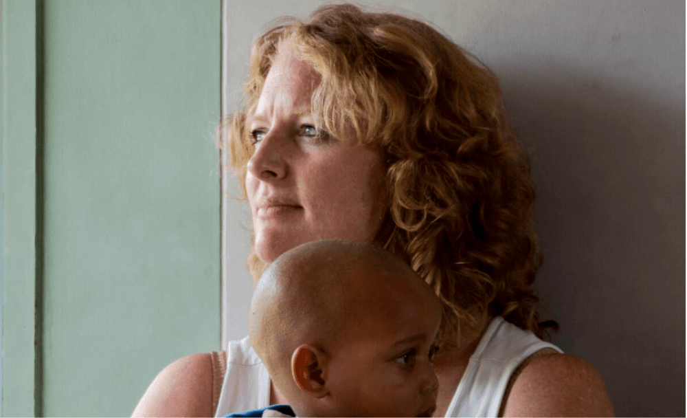
Sarah – Client, Tanzania/Australia

Connie – UI Design, California

Brad – Development, Tennessee
Different disciplines, countries and time zones. One shared version of the work.
WORK / PLASTER HOUSE
Results
A fourfold increase in donations.
More donations helped fund new buildings, local staff, surgeons and care for more children.

“Tim is knowledgeable, professional and incredibly easy—and fun—to work with. He took the time to understand our needs and offered realistic options and suggestions for moving forward.”
– Meghan Cleary, The Plaster House
Get in Touch
Contact
Senior product design for work that’s stalled, disorganised or difficult to ship.
Available for senior contract and permanent roles, and focused consulting work.
078 757 0447
© 2026 Tim Jones